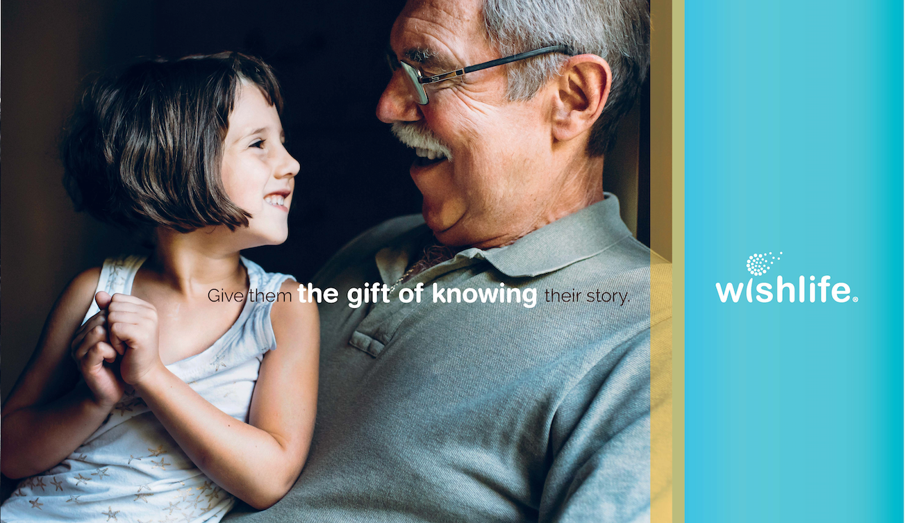
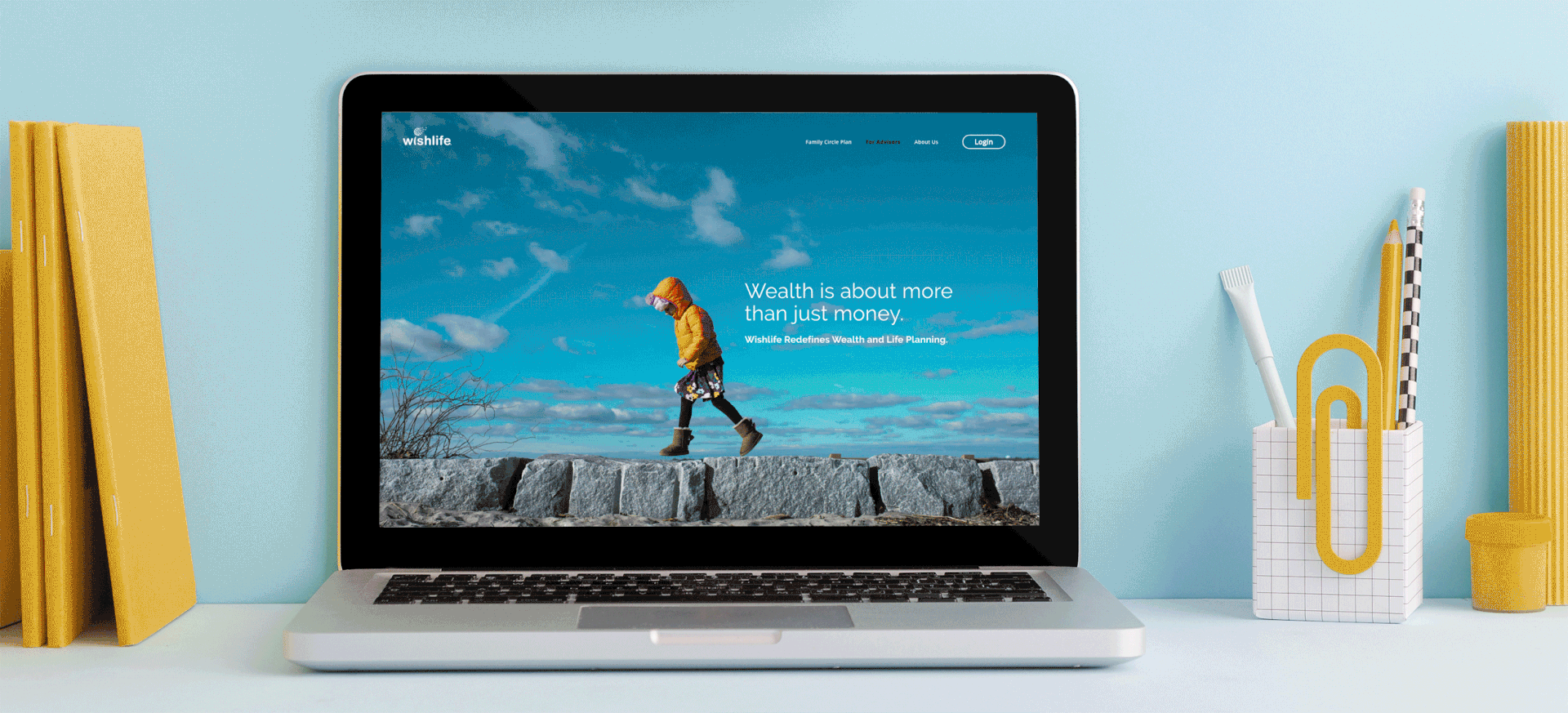
Defining a SaaS product unlike any other.
The challenge was to clarify the USP in and provide design solutions that distinguish the brand. Collaborating directly with the clients marketing and dev team, we developed a visual direction that feels at home in the tech space, yet appeals to the senior demographic with a type system and color palette that are anything but retro.

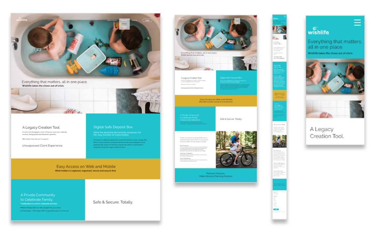
Results that speak to both users and investors.
With a comprehensive visual language and own-able market position across print and digital, the client now had a set of tools that communicated the offering, resulting in increased valuation and ultimately the purchase of the company.
Contribution & Credits
+ Brand Design Systems
+ Creative Development
+ Digital Design
+ Print Production
+ Content Design and Infographics
+ UX/UI and Prototyping
+ Website User-Flow
Photographer: Anna Liisa-Nixon