Defining a SaaS for the most human of needs.
My challenge was to help a high-growth client clarify their offering, defining a USP within an all new visual brand design, along with a story that appeals to a progressive senior demographic.
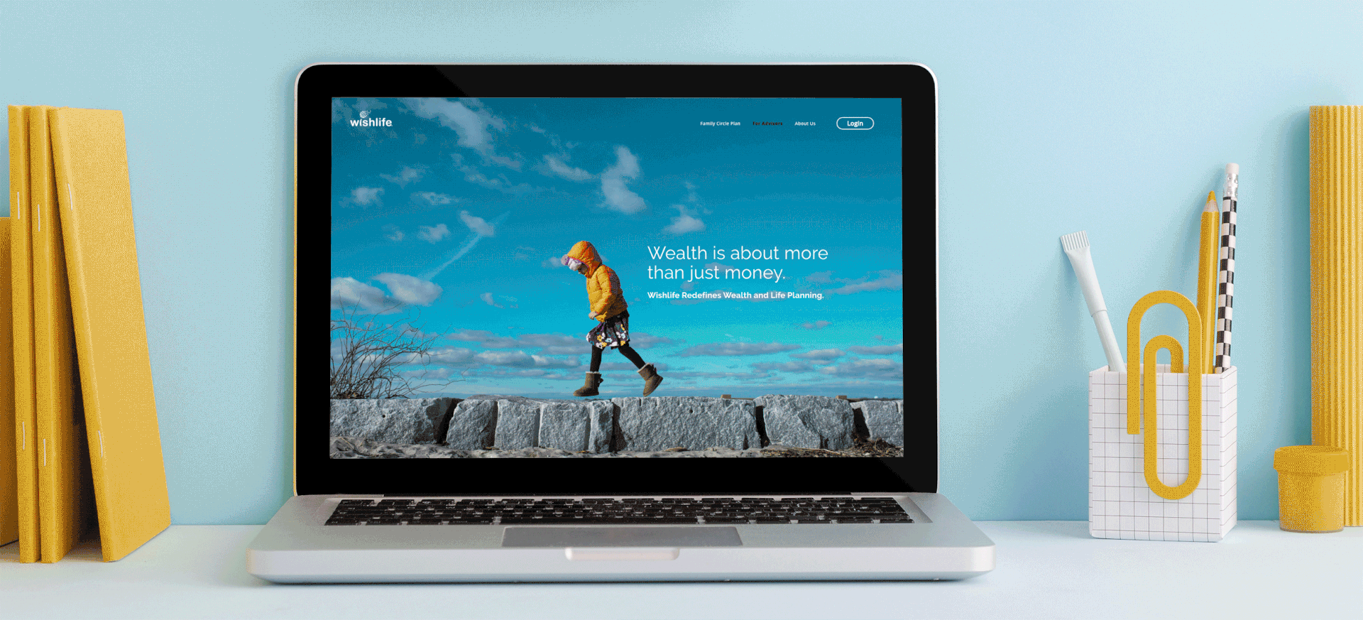
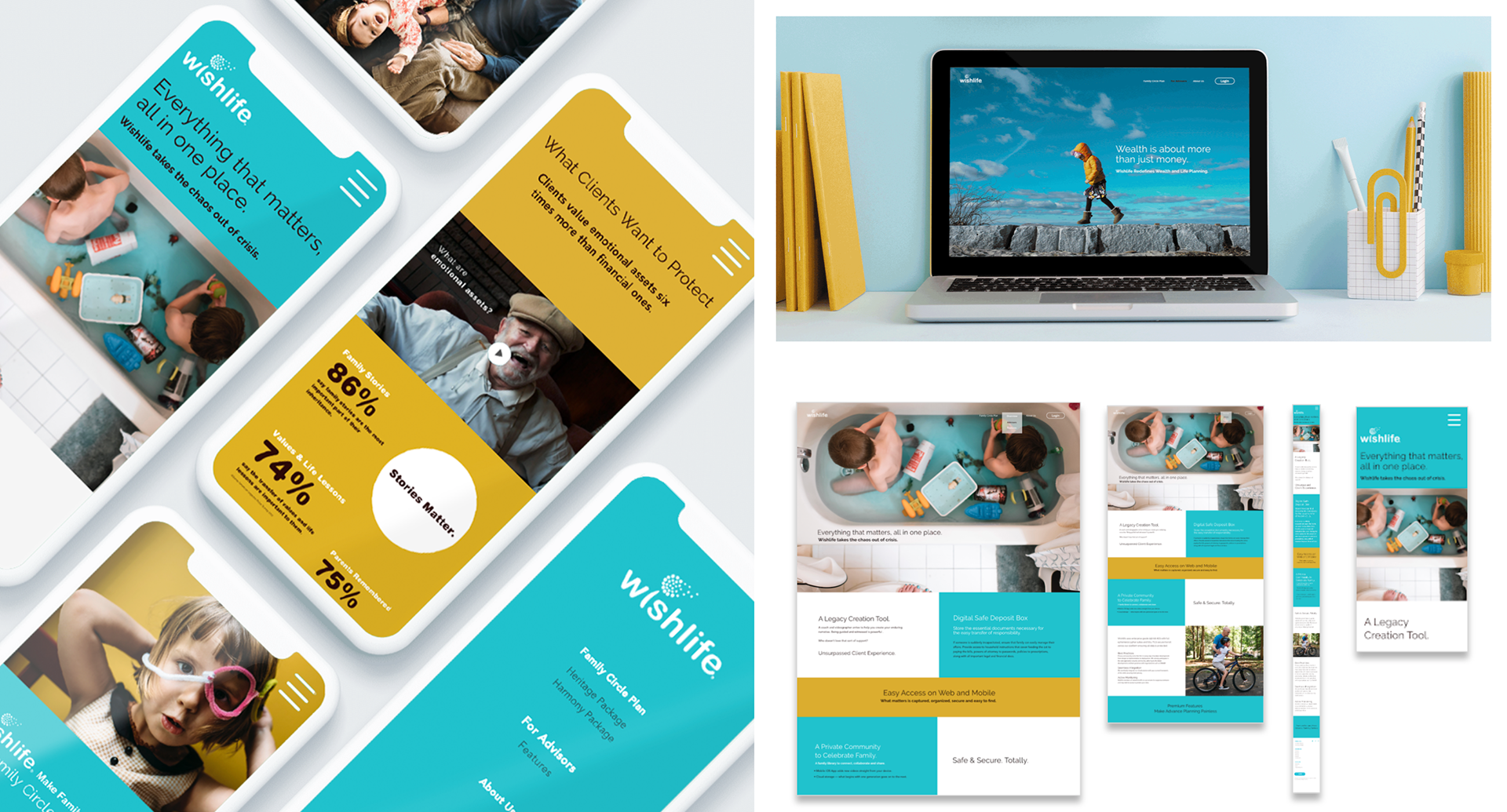
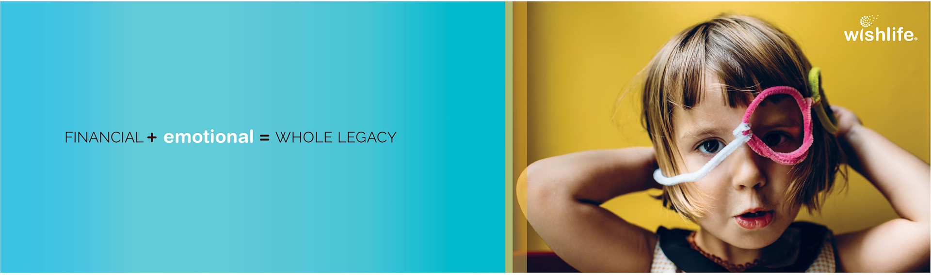
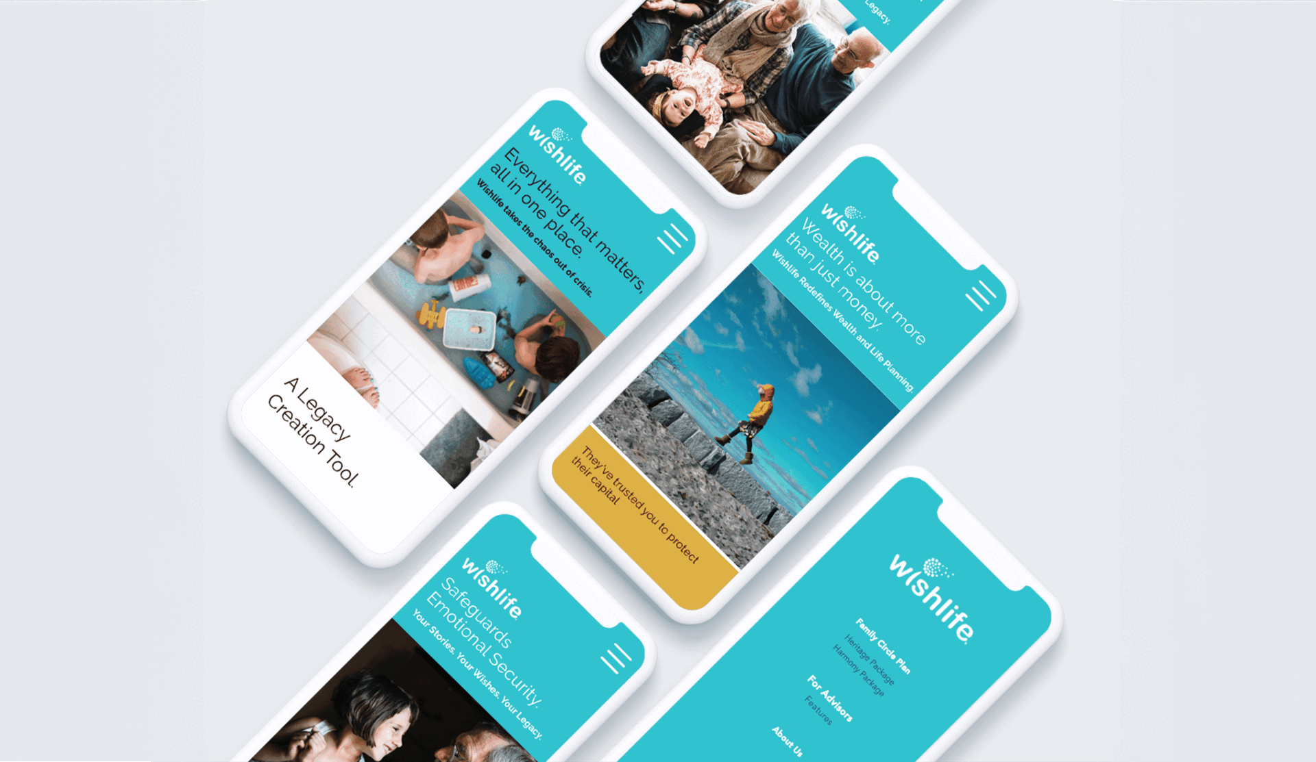
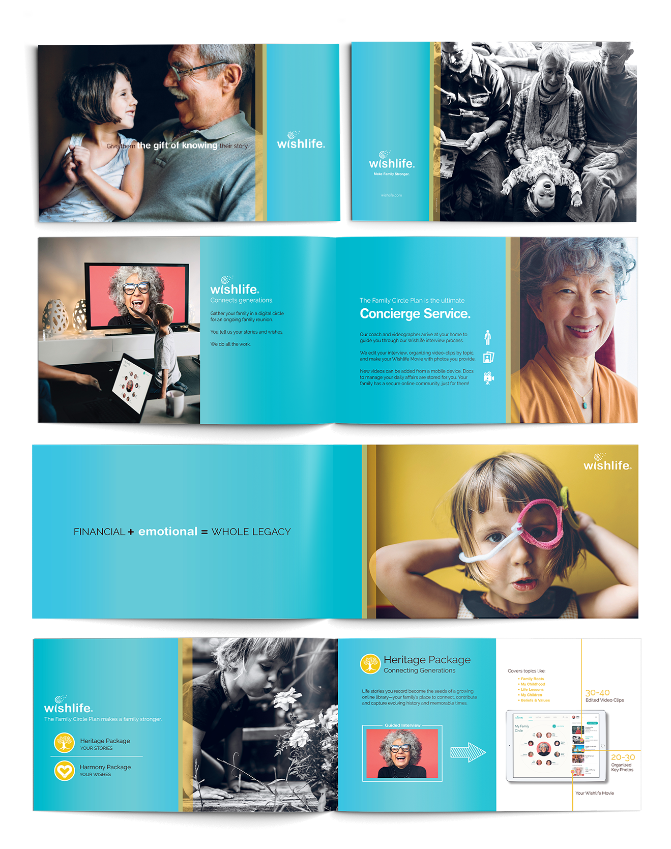
The resulting brand story and visual language included an all new digital experience that feels anything but retro with a color palette and type system that together defy conventions in the SaaS space.
Speaking to users and investors.
With a now comprehensive visual language and own-able market position across print and digital, the client now had an all new set of tools that communicated the offering resulting in increased valuation and ultimately lead to the purchase of the company.
+ Brand Development
+ Art Direction
+ Creative Storytelling
+ High-End Print Design x Production
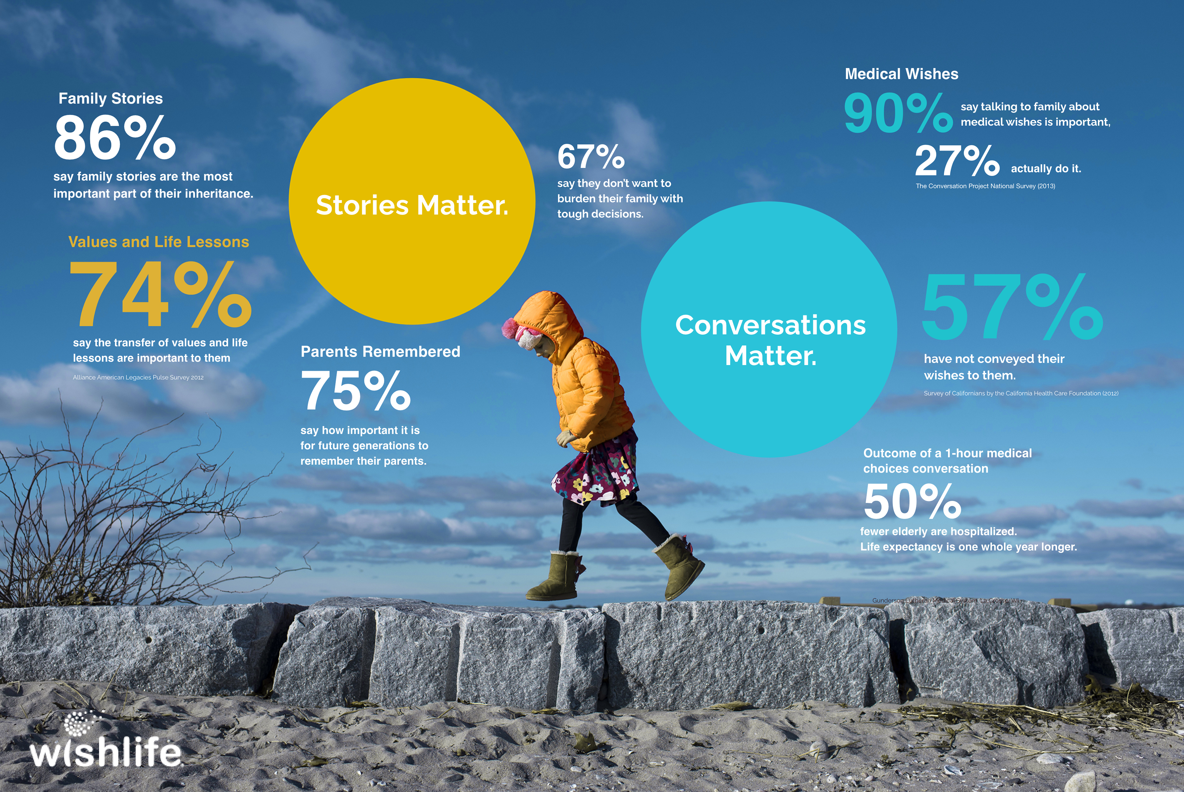
+ Content x Infographics
+ UX/UI Design
+ Rapid Prototyping
+ User-Journey
Photographer: Anna Liisa-Nixon